


Project Overview
We redesigned the website for Dr. Erica Polk’s Dental Clinic, a community-centered practice in Memphis, Tennessee. Our goal was to create a warm, professional, and user-friendly website experience that reflects the clinic’s welcoming atmosphere and commitment to high-quality care. This project was completed as part of UC San Diego’s COGS 187B course on Advanced Interaction Design.
Problem Statement
Patients visiting Dr. Polk’s clinic often found the original website confusing, outdated, and lacking warmth. With an overwhelming number of navigation tabs and inconsistent visuals, users had difficulty locating essential information such as services, appointment options, and staff details. These gaps made it challenging for both new and returning patients to build trust, engage with the content, or feel confident navigating the site.
Our Solution
We designed a modern, patient-first website that reflects Dr. Polk’s warm and community-focused approach to dental care. Rather than reinventing the clinic’s identity, we focused on enhancing access to care by making key services and information easier to find and more welcoming to interact with. In addition, we introduced a responsive homepage layout with concise calls-to-action, dedicated service pages with visual support and FAQs, and an expanded "About Us" section highlighting Dr. Polk and her team. Swipeable testimonial carousels, improved visual hierarchy, and device-responsive elements ensured that users could easily book appointments, learn about different services, and feel confident navigating the site. By designing for real users and their experiences, we made the digital extension of Dr. Polk’s clinic feel as caring and clear as an in-person visit.
Research
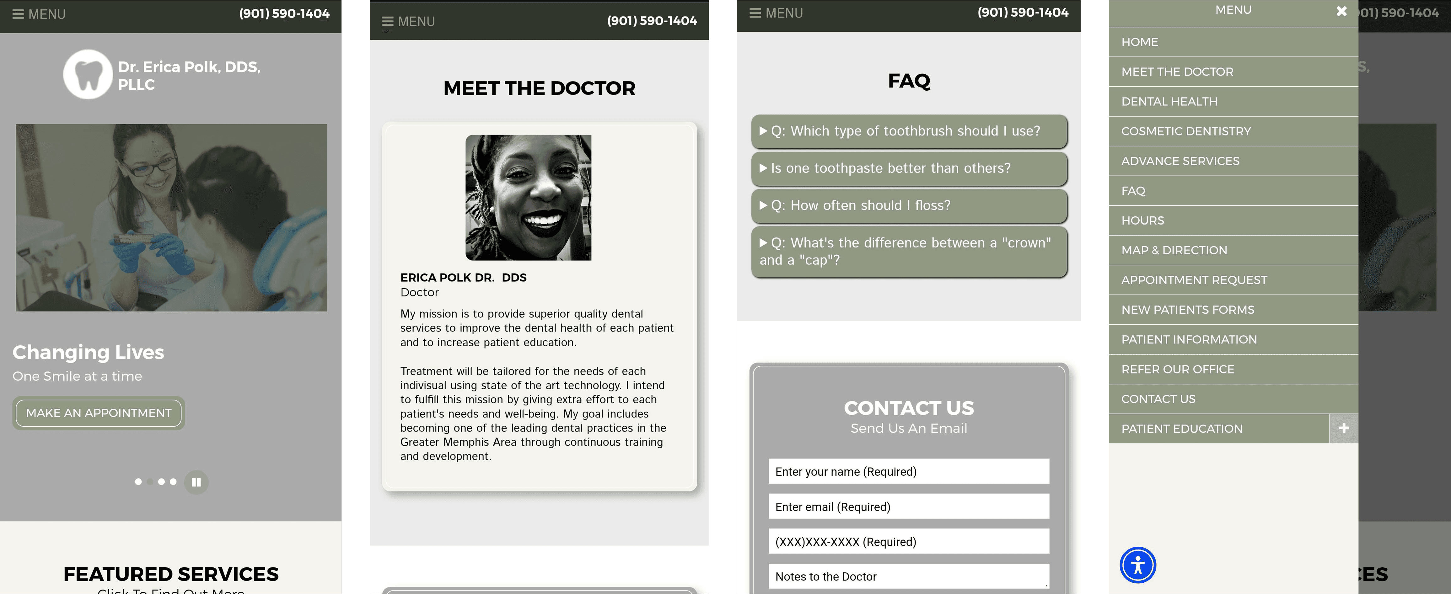
Current Design
User Interviews
We interviewed 10 users affiliated with the clinic (e.g., regular patients, family-friends, and new visitors) across a wide age range and tech familiarity. The interviews revealed that users wanted:
Clear access to services and appointment booking
Simple, readable content with real visuals (not stock photos)
A better understanding of Dr. Polk and the staff’s qualifications
Educational content about preventative dental care
Competitive Analysis
To inform our design direction, we conducted a competitive analysis of local and regional dental clinic websites, including Pediatric Dental Care of Memphis, Bellano Dental Health, Shelby Dental, and Dental Excellence PC. We evaluated branding, content structure, interactivity, and design tone. We discovered that:
Most sites used calming blue or pastel palettes with simple, clean layouts to create a sense of professionalism and trust.
Common structural components included About pages, Contact info, Services, Patient Resources, and Appointment Booking.
Pediatric Dental Care stood out for its rich interactivity and well-organized patient resources, particularly their use of real staff images and a clear testimonial carousel.
Bellano Dental Health impressed with minimal, mobile-friendly layouts, but lacked visual variation and personalization.
Shelby Dental and Dental Excellence had strong functionality but were inconsistent in content and image quality.
Many clinics overused stock images, which felt impersonal.
| Pediatric Dental Care of Memphis | Bellano Dental Health | Shelby Dental | Dental Excellence, PC | Great Lengths Hair Salon |
Branding | Playful and fun vibe with bright colors. It can be eye-catching to children. | Professional, modern, and playful. Consistent colors and style throughout | Professional, mild, and calm. Strong minimalism | Professional with dark colors, friendly, and informative. | Presents a professional, bold, friendly, and minimalistic style. |
Functionality | Has great interactive and clickable content but a filter or a search bar can help especially there’s a lot of content and blogs. | Very interactive, clickable, accessible, and easy to find information through menu. Has a blog and social media too | Confusing for browsing. Horrible wording, but you can learn the basics of the business if you have the care to learn. | Not much interaction, but the appointment booking feature could be improved for a better experience | Lacks major interactions, however, includes a small filter feature on the service page to help users find specific services. |
Content | Does a great job summarizing through bulleted points in a detailed manner. Creates a safe space for parents and their children with reassurance. | Various ways to learn about business, staff, locations, dentistry, and payment options. All kinds of patients can learn about Bellano | To the point, talks about all services, and description of the dentist. Scarce content but touches most of the important topics | Does a great job summarizing each service, but lack consistency with the stock photos used. | Prioritizes creating a safe, healthy, and inviting atmosphere through realistic images. Includes relevant information in accessible locations. |
Site Architecture | The menu is organized in a logical manner based on the dentists, pediatric dentistry, patient info, reviews, and more. All info are relevant to it’s menu. | Detailed, organized, and interactive menu. The beautiful table of contents of the website is linked in the menu. It is not cluttered but repeats | The menu is minimalistic, and you can access major pages through the menu. Could use better spacing between links | The menu navigation is organized and not cluttered. The different types of services are listed in the services page rather than part of the menu. | The site layout is logical, however, some buttons don’t function or are repetitive, especially in the navigation bar. |
Design | Font color contrasts need some work, can be unreadable at times and spacing is inconsistent. | Light blue, white, and deep blue. Variations add fun during viewing. Random errors sometimes. | Simple. Too simple. Undercooked: needed to be tested on mobile before being published. | Font color contrast should be explored, but the font weight creates enough contrast on the site. | The color palette, font, images, and organization are consistent, but some margins look awkward. |
We also drew inspiration from Great Lengths Hair Salon’s authentic use of real images, personalized staff bios, and inviting aesthetic, despite being outside the dental industry. This helped reinforce our goal of creating a site that feels trustworthy, friendly, and locally grounded. An in-depth analysis can be viewed here.
Design
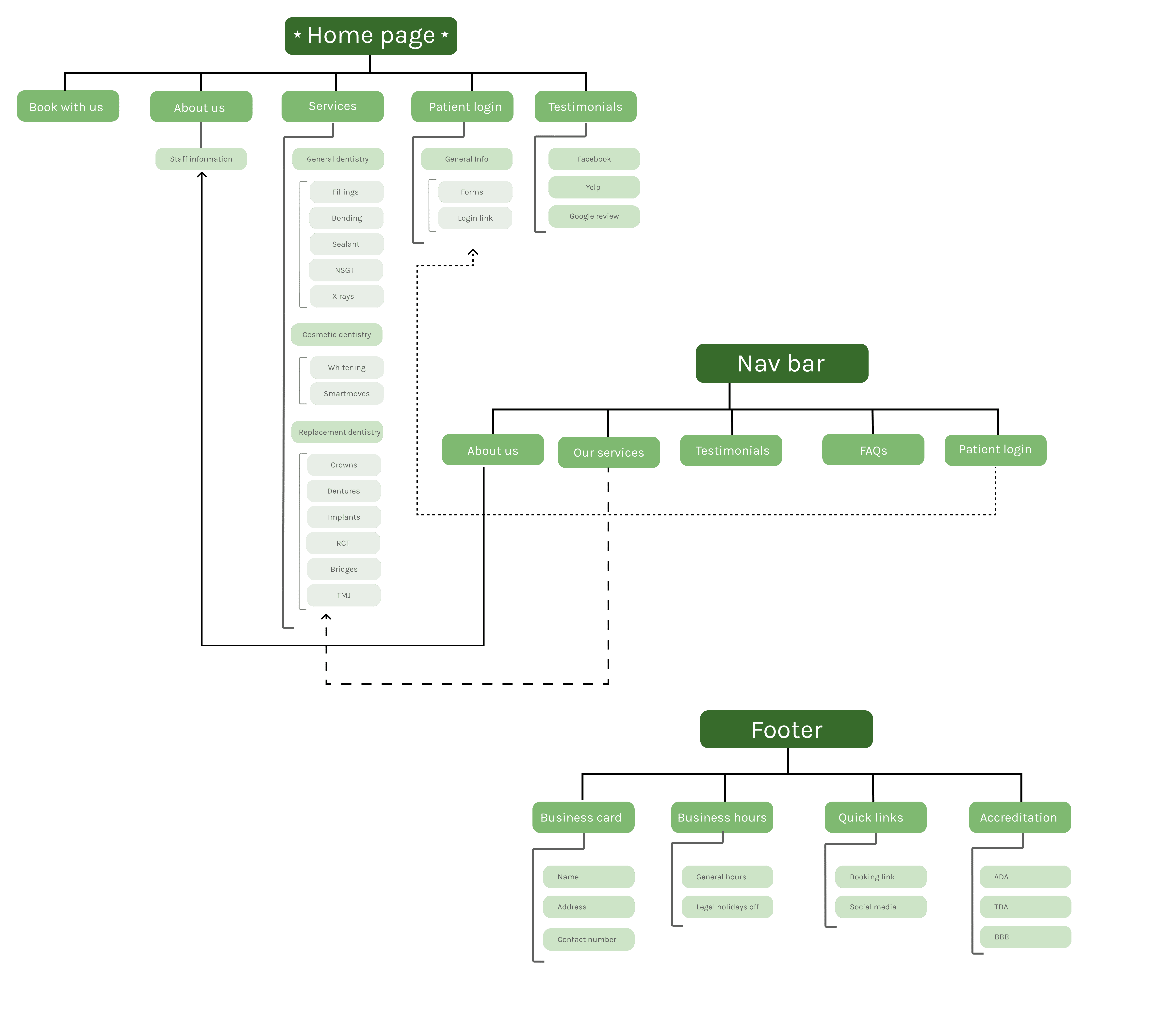
Site Architecture
Before diving into wireframes, we carefully restructured the website’s information hierarchy. Our goal was to reduce cognitive overload while ensuring patients could quickly find the content that mattered most, such as services, staff information, and testimonials.
We condensed the original navigation into five key categories and prioritized sections like "About Us," "Testimonials," and "Services" based on user research. We intentionally placed contact info and appointment actions in persistent, easy-to-access areas like the header and footer.
Our architecture was informed by competitor site patterns and the specific expectations of patients accessing the site from mobile devices. This early groundwork helped shape a more coherent and intuitive user journey
Brainstorming & Low-fi Wireframes
We started by establishing core design principles: warmth, clarity, and trust. Using our personas and use cases from the interview data, we created empathy maps, grouped pain points with affinity mapping, and explored layout ideas that emphasized ease of use and credibility.
Afterwards, we drafted mobile-first layouts on paper and FigJam. These early concepts focused on a simplified homepage, sectioned service pages, and a personalized “About Us” story.
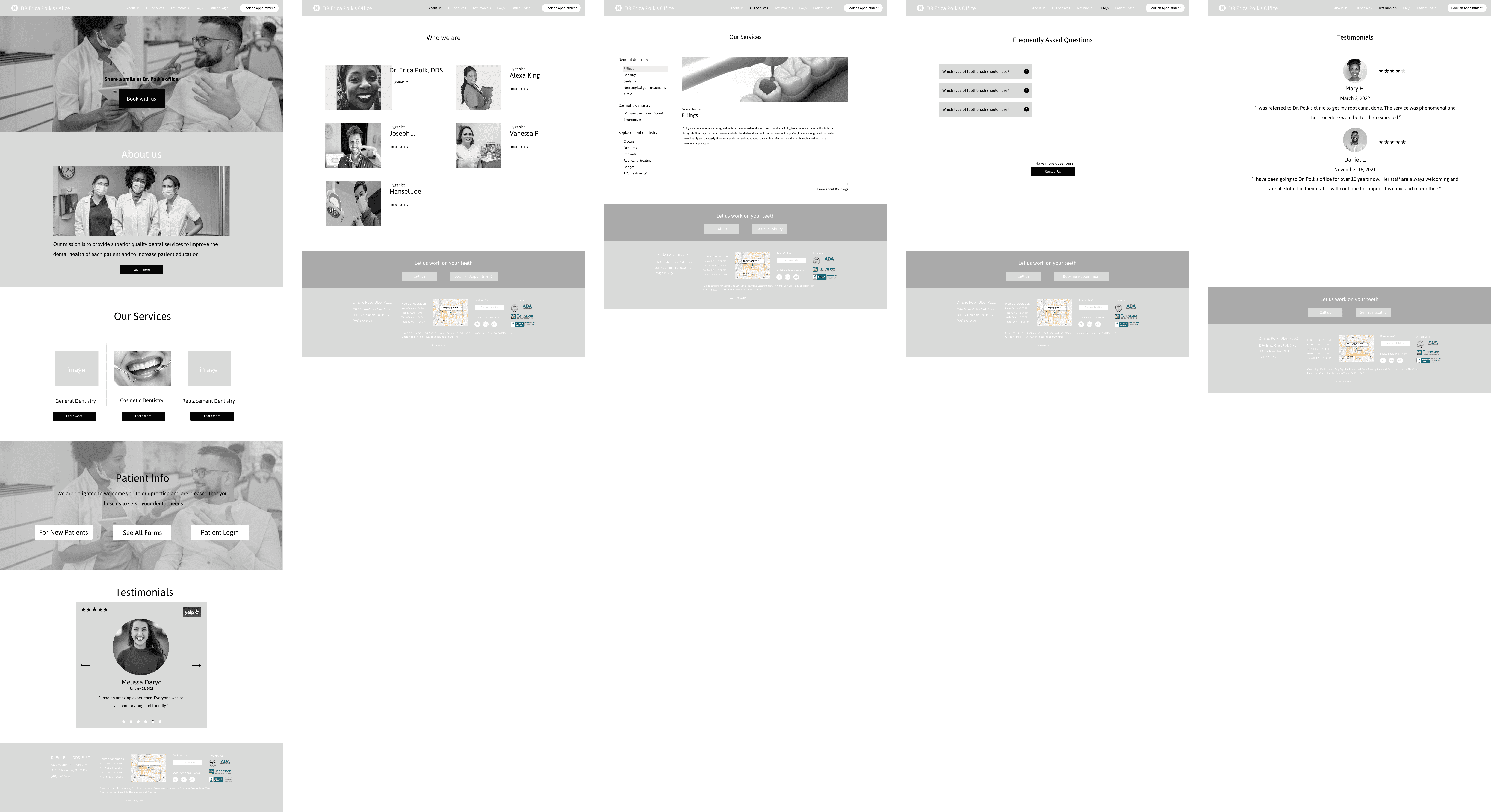
Desktop Version
Mobile Version
Feedback
We sent these wireframes out to our peers and clients for feedback and learned:
Collapsible FAQ sections were helpful, but overuse of collapsibles was frustrating on mobile.
Some content was inconsistent between mobile and desktop.
Navigation had improved, but links were still confused with underlined text.
Testimonials needed to be more interactive on the home screen.
Branding
Our visual direction was inspired by calming and welcoming jewel-toned colors to foster a sense of comfort and trust. These colors reflect the quiet confidence and care Dr. Polk provides her patients. We wanted to create a visual identity that balanced professionalism with a welcoming, grounded feel.
Additionally, we were intentional about spacing, contrast, and text hierarchy, prioritizing clear calls to action and easily scannable layouts to reduce cognitive load and guide users seamlessly through their tasks.
Final Designs
Our final design centered on creating a cohesive, welcoming, and accessible experience that addressed both user frustrations and client goals. We streamlined the site’s structure by condensing the navigation menu, crafted a mobile-first layout to ensure responsiveness, and emphasized human connection through authentic content and imagery.
We introduced updated service pages, an expanded staff introduction, and a clearer path to actions like appointment scheduling and accessing patient info. These design decisions were paired with thoughtful content organization and improved visual hierarchy, allowing users to find what they need with ease and confidence.
Desktop Version
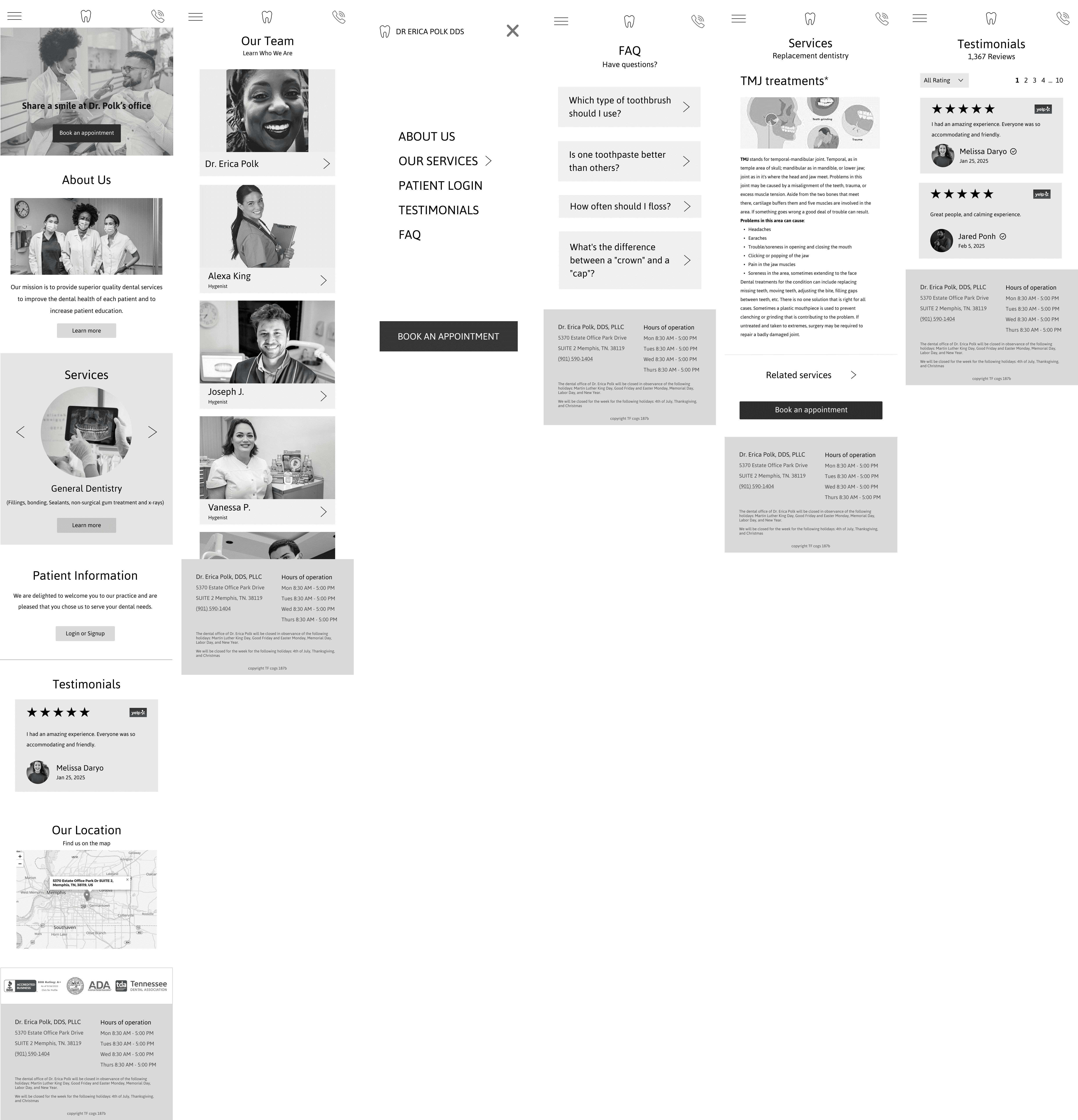
Mobile Version
Conclusion
Results & Impact
Our redesign resulted in a more intuitive and engaging website that reflects the warmth and professionalism of Dr. Polk’s dental clinic. By simplifying the navigation, emphasizing authentic visuals, and structuring content with clarity, we helped create a more patient-centered experience that fosters trust, comfort, and action. The client expressed strong interest in implementing several of our proposed features on the live site.
Throughout this project, we learned the importance of aligning digital design with the emotional tone of a physical space. Authentic imagery builds deeper trust than stock photography, while thoughtful layout decisions reduce friction in high-stakes contexts like healthcare. We also discovered how crucial it is to maintain consistency across devices, especially given how many patients access the website on mobile. Lastly, we were reminded that strong UX is as much about how users feel as it is about what they do in fields like dentistry, where clarity, comfort, and confidence directly influence a patient’s willingness to engage.
Next Steps
If we had more time to continue this project, we would deepen our collaboration with Dr. Polk and her staff to gather authentic photographs of the team, clinic, and patient experience, bringing a more personal, trustworthy feel to the site. We would also conduct broader user testing with a more diverse audience to ensure usability and comfort across different age groups, tech experience levels, and accessibility needs.
In addition, we would continue iterating on the testimonial page, incorporating more refined micro-interactions to enhance engagement, such as hover animations, swipe gestures, or auto-play options for testimonials. These enhancements would aim to make patient voices more visible and dynamic across the site.


